- Top Part
- Middle Part:
- . Product Image Border Radius (px)
- 2. Price Style
- 3. 'Saving Text' for Discount Product
- 4. Font Size & Color (Saving Text)
- 5. Enable Quantity Box
- 6. Quantity Box Styling
- 7. Product Title Styling
- 8. Price Typography & Color
- 9. Display Stock Qty
- 10. Shopper Count Notice
- 11. Section Background Colors
- 12. Enable Sale Time Badge
- 13. Sale Expiry Settings
- 14. Fallback Urgency Timer
- Bottom Part
- Checkout button
- Cart Button:
- General Settings
- Reward Progress Bar
- Suggested Product Display:
- Coupon Settings:
- Estimate Delivery Settings:
- Shipping:
When you click on the shopping cart icon, you will immediately see a side cart open. Moreover, the side cart will auto-open when customers cart a product. it is a multi-featured side cart. To make customization easier, we have divided the sidebar mini cart into four (4) sections,
Top Part
Middle Part
Bottom Part
Checkout
Cart
GenertalReward Bar
Suggested Products
Coupon
Shipping
Estimate Delivery time
Top Part #
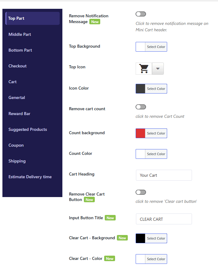
1. Remove Notification Message #
-
Type: Toggle / Checkbox
-
Description: Enable this option to hide or remove the announcement/notification message banner displayed at the very top of the mini cart header.
2. Top Background #
-
Type: Color Picker
-
Description: Select the background color for the mini cart’s header area.
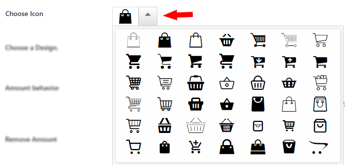
3. Top Icon #
-
Type: Icon Picker / Dropdown
-
Options: Built-in vector icons (e.g.,
fcp_icon_1,fcp_icon_2,icon_19,icon_20, etc.) orNoneto disable. -
Description: Choose an icon to display alongside your mini cart header title or notification message. Select None if you don’t want to show any icon.
4. Icon Color #
-
Type: Color Picker
-
Description: Select the custom color for the header icon to match your brand style.
5. Remove Cart Count #
-
Type: Toggle / Checkbox
-
Description: Enable this option to hide the total item count badge (e.g., the number showing how many items are in the cart) from the header.
6. Cart Count Styling #
-
Count Background: Select the background color for the item counter badge.
-
Count Color: Select the text color for the number inside the item counter badge.
7. Cart Heading #
-
Type: Text Input
-
Description: Enter a custom title/heading for your mini cart header (e.g., “Your Shopping Cart”, “My Bag”, or “Review Your Order”).
8. Clear Cart Button Controls #
-
Remove Clear Cart Button: Enable this toggle to hide the “Clear Cart” button from the header to prevent shoppers from accidentally emptying their cart.
-
Input Button Title: Customize the text displayed on the Clear Cart button (Default:
Clear Cart). -
Clear Cart – Background: Select the background color for the Clear Cart button.
-
Clear Cart – Color: Select the text and icon color for the Clear Cart button.
Middle Part: #
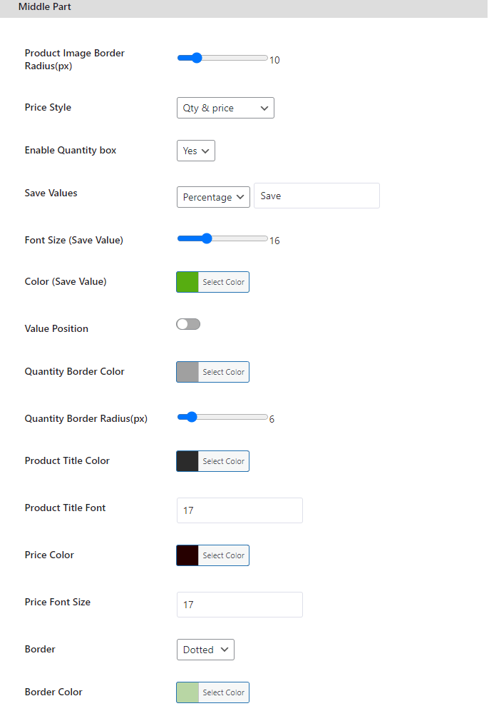
. Product Image Border Radius (px) #
-
Type: Number Input
-
Description: Set the corner roundness of the product thumbnail images in pixels. (e.g.,
0for sharp corners,8for rounded corners, or50for circular images).
2. Price Style #
-
Type: Radio Options
-
Options:
-
Default Price: Displays the standard product price as configured in WooCommerce.
-
Current Price: Shows only the active selling price (discounted price).
-
Qty & Price: Displays quantity alongside unit price (e.g.,
2 × $15.00). -
Product Subtotal: Displays the total price for that line item (e.g.,
$30.00).
-
-
Description: Choose how item prices are displayed inside the cart drawer.
3. ‘Saving Text’ for Discount Product #
-
Type: Text Input
-
Shortcodes Available:
-
{{save_amount}}— Displays the total money saved (e.g.,$5.00). -
{{save_percentage}}— Displays the discount percentage (e.g.,20%).
-
-
Description: Customize the savings badge text displayed on discounted items. Example:
Save {{save_amount}} ({{save_percentage}} off!).
4. Font Size & Color (Saving Text) #
-
Font Size (px): Set the font size for the savings badge text (Default:
13px). -
Color: Choose the font color for the savings badge text using the color picker.
5. Enable Quantity Box #
-
Type: Radio Options (
Yes/No) -
Description: Enable or disable the quantity increment/decrement (+ / -) input box for items in the mini cart.
6. Quantity Box Styling #
-
Quantity Border Color: Select the border color for the quantity input box.
-
Quantity Border Radius (px): Set the corner roundness of the quantity box (Default:
6px).
7. Product Title Styling #
-
Product Title Color: Choose the font color for item titles in the cart.
-
Product Title Font: Select the font size, weight, or typography style for product titles.
8. Price Typography & Color #
-
Price Color: Pick the color for product prices.
-
Price Font Size (px): Set the font size for item prices.
9. Display Stock Qty #
-
Type: Toggle / Text Input
-
Shortcode Available:
{{display_stock}} -
Description: Show remaining inventory stock for items in the cart. Example:
Only {{display_stock}} left in stock!. -
Stock Color: Select the text color for the stock notice.
10. Shopper Count Notice #
-
Type: Toggle / Setting
-
Description: Displays social proof by showing how many customers are currently viewing or have purchased the item (e.g., “15 shoppers bought this today”).
11. Section Background Colors #
-
Middle Background: Choose the main background color for the middle content area of the mini cart drawer.
-
Item Box Background: Choose the background color for individual product item cards/boxes.
12. Enable Sale Time Badge #
-
Type: Toggle
-
Description: Displays a dynamic countdown badge under the savings text if a “Sale End Date” is configured in WooCommerce Product Settings (Product > Edit > General > Sale Price Dates).
13. Sale Expiry Settings #
-
Sale Expiry Text: Customize the label displayed next to the countdown timer.
-
Display Format: Choose how remaining time is formatted:
-
2 hours 15 mins(Verbose) -
2d 5h(Compact) -
02:15:00(Digital Clock)
-
-
Only Show When Under (hours): Set a threshold in hours. The badge will stay hidden until the remaining time falls below this limit (e.g., enter
24to show the badge only in the last 24 hours). -
Badge Text Color: Select the font color for the sale expiry text and timer.
14. Fallback Urgency Timer #
-
Type: Toggle
-
Description: Ensures non-stop buying urgency. If a product does not have a scheduled sale end date or the sale date has expired, this feature automatically displays a dynamic looping countdown timer.
Bottom Part #
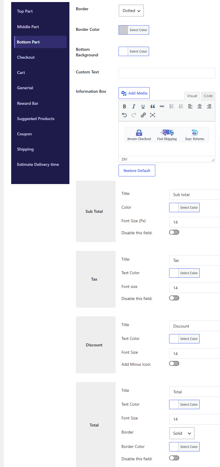
1. Footer Border & Background #
-
Border Style: Choose the border style for the bottom section (e.g., Dotted, Solid, Dashed, or None).
-
Border Color: Select the border color for the bottom section dividers.
-
Bottom Background: Select the background color for the mini cart footer area.
2. Information Box Module #
-
Custom Text: Enter custom HTML or text to display extra information in the footer box (e.g., store announcements, security badges, or payment guarantees).
3. Subtotal Settings #
-
Title: Customize the label text for the subtotal row (Default:
Subtotal). -
Color: Choose the font color for the subtotal title and amount.
-
Font Size (px): Set the font size in pixels for the subtotal text (Default:
14px). -
Disable this field: Enable this checkbox to completely hide the Subtotal row from the cart drawer.
4. Tax Settings #
-
Title: Customize the label text for the tax row (Default:
Tax). -
Text Color: Choose the font color for the tax label and amount.
-
Font Size (px): Set the font size in pixels for the tax text (Default:
14px). -
Disable this field: Enable this checkbox to hide the Tax calculation row from the cart footer.
5. Discount Settings #
-
Title: Customize the label text for applied discounts (Default:
Discount). -
Text Color: Choose the font color for the discount label and saved amount.
-
Font Size (px): Set the font size in pixels for the discount row text (Default:
14px). -
Add Minus Icon: Toggle this option to automatically display a minus sign (
-) before the discount amount (e.g.,-$10.00).
6. Final Total Settings #
-
Title: Customize the label text for the grand total row (Default:
Total). -
Text Color: Select the font color for the grand total title and final amount.
-
Font Size (px): Set the font size in pixels for the total amount to make it stand out (Default:
14px). -
Border Style: Choose the divider line style above the final total (Default:
Solid). -
Border Color: Select the color for the divider line above the total.
-
Disable this field: Enable this checkbox to hide the Grand Total row from the cart footer.
Checkout button #
#
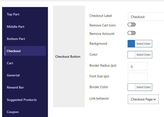
1. Checkout Label #
-
Type: Text Input
-
Default:
CheckoutorProceed to Checkout -
Description: Enter the custom text you want to display on the primary checkout button (e.g., “Proceed to Checkout”, “Complete Order”, or “Buy Now”).
2. Remove Cart Icon #
-
Type: Toggle / Checkbox
-
Description: Enable this option to hide the shopping cart vector icon from inside the Checkout button for a cleaner, text-only look.
3. Remove Amount #
-
Type: Toggle / Checkbox
-
Description: Enable this option to hide the total order price from inside the Checkout button (e.g., hides the
$50.00in “Checkout — $50.00”).
4. Button Appearance & Styling #
-
Background: Select the fill color for the Checkout button.
-
Color: Select the font and icon color for the button text to ensure contrast.
-
Border Radius (px): Set the corner roundness of the Checkout button in pixels (e.g.,
0for square corners,8for rounded, or30for pill-shaped). -
Font Size (px): Set the font size of the Checkout button text.
-
Border Color: Select the border color surrounding the Checkout button (if a border is applied).
5. Link Behavior #
-
Type: Dropdown
-
Options:
-
Open in Same Tab: Redirects the user to the standard WooCommerce checkout page in the current browser window.
-
Open in New Tab: Opens the checkout page in a new browser tab/window.
-
Custom URL / Express Checkout: Redirects shoppers directly to a custom link or express payment gateway (if configured).
-
-
Description: Choose what happens when a customer clicks the Checkout button.
Cart Button: #
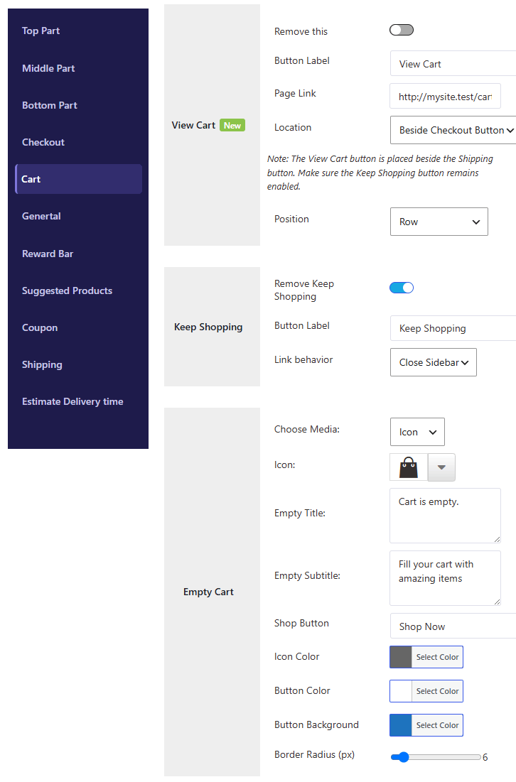
1. View Cart Button Settings #
-
Remove this: Toggle this option to hide or remove the “View Cart” button from the mini cart.
-
Button Label: Enter custom text for the button (e.g., “View Cart”, “Go to Cart”).
-
Page Link: Select or enter a custom URL where users will be redirected when clicking the button (Default: WooCommerce Cart page).
-
Location: Choose where to position the View Cart button inside the footer layout:
-
Beside Checkout Button— Places the View Cart button next to the primary Checkout button. -
Beside Shipping Button— Places it next to the Free Shipping / Shipping bar button.
Note: If set to Beside Shipping Button, ensure that the Keep Shopping button remains enabled for proper layout alignment.
-
-
Position: Choose the flex alignment for the button group:
-
Row— Displays buttons horizontally side-by-side. -
Row Reverse— Displays buttons horizontally in reverse order. -
Column— Stacks buttons vertically. -
Column Reverse— Stacks buttons vertically in reverse order.
-
2. Keep Shopping Button Settings #
-
Remove Keep Shopping: Toggle this option to hide the “Keep Shopping” / “Continue Shopping” button.
-
Button Label: Enter custom text for the button (e.g., “Keep Shopping”, “Continue Browsing”).
-
Link Behavior: Choose what happens when a customer clicks the button:
-
Close Sidebar— Closes the mini cart drawer and keeps the user on the current page. -
Shop link— Redirects the customer directly to the main WooCommerce Shop page.
-
3. Empty Cart State Settings #
When the customer’s cart is empty, you can customize the icon, messaging, and shop button shown inside the cart drawer.
-
Choose Media: Select the visual icon/media type for the empty cart state:
-
Icon— Choose from built-in vector icons. -
Image— Upload a custom image/illustration. -
None— Hide the visual media entirely.
-
-
Icon Selection: Select an icon style from the preset library (
Icon 1toIcon 42, orwhmcNone). -
Empty Title: Enter the main heading text shown when the cart is empty (e.g., “Your cart is empty”).
-
Empty Subtitle: Enter supporting helper text (e.g., “Looks like you haven’t added anything to your cart yet.”).
4. Empty Cart Shop Button & Styling #
-
Shop Button: Custom text for the call-to-action button when the cart is empty (e.g., “Start Shopping”, “Explore Products”).
-
Icon Color: Choose the color for the empty cart state vector icon.
-
Button Color: Choose the font/text color for the “Start Shopping” button.
-
Button Background: Choose the background fill color for the “Start Shopping” button.
-
Border Radius (px): Set the corner roundness of the empty cart shop button in pixels (e.g.,
6pxfor rounded corners,30pxfor a pill button).
General Settings #
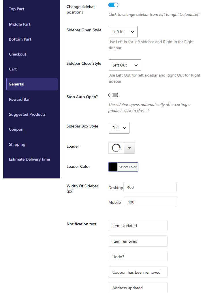
1. Change Sidebar Position #
-
Type: Toggle / Checkbox
-
Default:
Left -
Description: Toggle this option to switch the mini cart drawer position between the left and right side of the screen.
2. Animation & Transition Styles #
-
Sidebar Open Style: Select the slide-in animation direction when the mini cart drawer opens:
-
Left In— Slides in from the left edge (Recommended for Left sidebar). -
Right In— Slides in from the right edge (Recommended for Right sidebar). -
Top In— Slides down from the top. -
Bottom In— Slides up from the bottom.
-
-
Sidebar Close Style: Select the slide-out animation direction when the mini cart drawer closes:
-
Left Out— Slides out to the left edge. -
Right Out— Slides out to the right edge. -
Top Out— Slides up to the top. -
Bottom Out— Slides down to the bottom.
-
3. Auto Open Behavior #
-
Stop Auto Open?: Enable this checkbox to prevent the mini cart sidebar from automatically sliding open whenever a customer adds a product to their cart.
4. Layout & Loader Styling #
-
Sidebar Box Style: Choose the overall height layout of the mini cart drawer:
-
Full— Stretches to fill 100% of the screen height. -
Small— Floating compact box style.
-
-
Loader Animation: Select the loading spinner animation style (
Loader 1throughLoader 6) displayed while AJAX requests process in the background. -
Loader Color: Pick the accent color for the loading animation spinner.
5. Drawer Dimensions & Notification #
-
Width Of Sidebar (px): Set custom width values in pixels for different devices:
-
Desktop: Enter width for desktop screens (e.g.,
400px). -
Mobile: Enter width for mobile screens (e.g.,
100%or320px).
-
-
Notification Text: Enter the standard announcement/notice text displayed at the top header area of the mini cart drawer.
6.Notification text: #
Customize the alert messages displayed at the top of the mini cart when specific actions occur:
-
Item Updated: Enter the message shown when a product quantity is changed (Default:
Item Updated). -
Item Removed: Enter the message shown when a product is deleted from the cart (Default:
Item removed). -
Undo Option: Enter the label text for restoring a recently removed item (Default:
Undo?). -
Coupon Removed: Enter the alert text displayed when an applied coupon is removed (Default:
Coupon has been removed). -
Address Updated: Enter the confirmation message shown when shipping or billing details are changed (Default:
Address updated).
Reward Progress Bar #
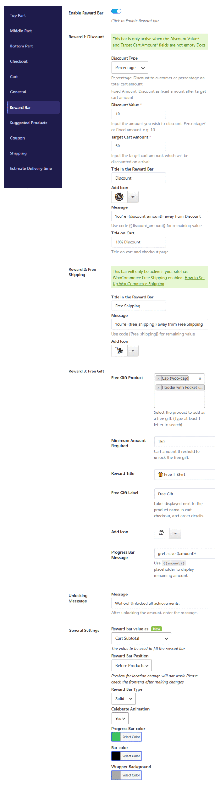
1. Enable Reward Bar #
-
Type: Toggle / Checkbox
-
Description: Enable or disable the entire multi-tier reward progress bar feature inside the mini cart.
2. Reward 1: Discount #
(Active only when Discount Value and Target Cart Amount fields are configured)
-
Discount Type: Select how the discount is calculated:
-
Percentage— Offers a percentage-off discount on the total cart amount. -
Fixed Amount— Applies a flat discount amount once the target spending limit is reached.
-
-
Discount Value: Enter the discount value (e.g.,
10for 10% or $10 off). -
Target Cart Amount: Set the cart subtotal required to unlock this discount (e.g.,
50). -
Title in the Reward Bar: Customize the label shown on the progress bar milestone (e.g.,
Discount). -
Add Icon: Choose a vector icon for the discount milestone badge.
-
Message: Dynamic text displayed before unlocking the goal.
-
Shortcode Available:
{{discount_amount}}— Displays the remaining amount needed (e.g.,You're {{discount_amount}} away from Discount).
-
-
Title on Cart: Label applied to the discount row in the cart and checkout pages (e.g.,
10% Discount).
3. Reward 2: Free Shipping #
(Active only if WooCommerce Free Shipping is enabled on your site)
-
Title in the Reward Bar: Customize the milestone label for free shipping (e.g.,
Free Shipping). -
Message: Dynamic text encouraging shoppers to hit the shipping goal.
-
Shortcode Available:
{{free_shipping}}— Displays remaining amount needed (e.g.,You're {{free_shipping}} away from Free Shipping).
-
-
Add Icon: Select a vector icon for the shipping milestone (e.g., Shopping Cart icon).
4. Reward 3: Free Gift #
-
Free Gift Product: Search and select one or multiple products to offer as a free gift upon reaching the spending goal.
-
Minimum Amount Required: Set the cart threshold required to unlock the free gift (e.g.,
150). -
Reward Title: Name of the reward displayed on the progress bar milestone (e.g.,
Free T-Shirt). -
Free Gift Label: Text badge shown next to the product name inside the cart, checkout, and order details (e.g.,
Free Gift). -
Add Icon: Choose a vector icon for the gift milestone (e.g., Gift box icon).
-
Progress Bar Message: Display text shown before unlocking the gift.
-
Shortcode Available:
{{amount}}— Shows remaining amount to spend (e.g.,Get active {{amount}}).
-
5. Unlocking Message #
-
Message: Enter the celebration text displayed when a customer unlocks all milestone achievements (e.g.,
Wohoo! Unlocked all achievements.).
6. General Settings (Styling & Configuration) #
-
Reward Bar Value As: Choose which cart total calculation fills the progress bar (e.g.,
Cart Subtotal). -
Reward Bar Position: Set where the progress bar is rendered inside the mini cart drawer (e.g.,
Before ProductsorAfter Products). -
Reward Bar Type: Select the visual style of the bar (e.g.,
Solid,Gradient, orSegmented). -
Celebrate Animation: Toggle
Yes/Noto trigger interactive celebration animations (e.g., confetti) when rewards are unlocked. -
Progress Bar Color: Pick the accent fill color for the active progress bar track.
-
Bar Color: Pick the background color for the inactive/remaining track.
-
Wrapper Background: Pick the overall container background color for the reward bar module
Suggested Product Display: #
 #
#
#
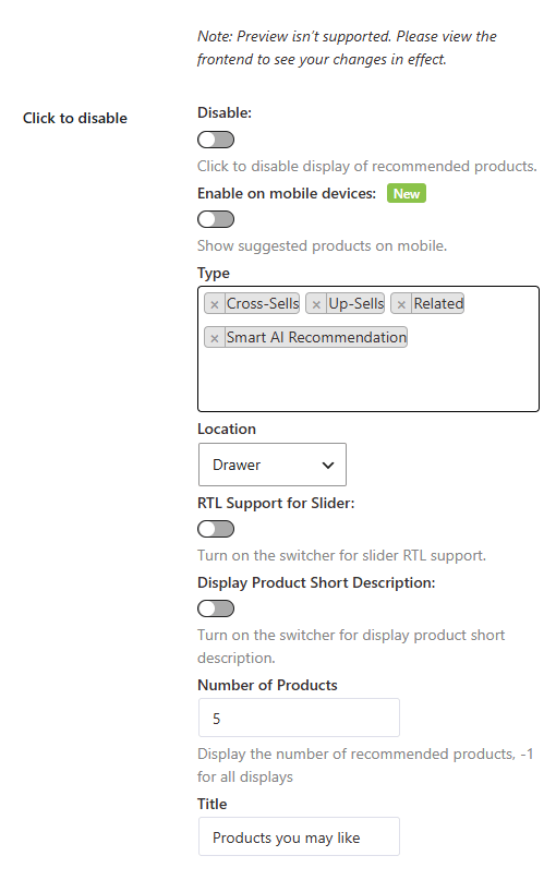
The Suggested Products feature allows you to display cross-sells, upsells, and AI-driven product recommendations directly inside the mini cart drawer or popup to boost average order value (AOV).
Note: Backend preview isn’t supported for this section. Please view your website’s front end to see live changes in effect.
1. General Controls & Visibility #
-
Disable:
-
Type: Toggle / Checkbox
-
Description: Enable this toggle to completely turn off and hide product recommendations from the mini cart.
-
-
Enable on Mobile Devices:
-
Type: Toggle / Checkbox
-
Description: Toggle
Onto display product suggestions to mobile shoppers. When toggledOff, suggestions will only be visible on desktop screens.
-
2. Recommendation Logic & Placement #
-
Type:
-
Type: Multi-select Input
-
Options:
Cross-Sells,Up-Sells,Related,Smart AI Recommendation -
Description: Select which recommendation sources to pull products from. You can choose single or multiple sources:
-
Cross-Sells: Pulls items manually configured in WooCommerce product settings (Linked Products > Cross-sells).
-
Up-Sells: Suggests higher-value alternatives configured under product options.
-
Related: Pulls products sharing similar categories or tags.
-
Smart AI Recommendation: Automatically predicts and displays relevant items using smart algorithms based on items currently in the cart.
-
-
-
Location:
-
Type: Dropdown
-
Description: Choose where the suggested product block will be rendered (e.g.,
Drawer,Popup, orBottom Footer).
-
3. Display & Layout Options #
-
RTL Support for Slider:
-
Type: Toggle / Checkbox
-
Description: Turn on this switcher to enable Right-to-Left (RTL) sliding support for languages like Arabic, Hebrew, or Persian.
-
-
Display Product Short Description:
-
Type: Toggle / Checkbox
-
Description: Enable this switcher to show a brief summary/short description underneath each suggested product title.
-
-
Number of Products:
-
Type: Number Input
-
Default:
5 -
Description: Set the maximum number of recommended products to display in the carousel/slider. Enter
-1to display all available matching products without a limit.
-
-
Title:
-
Type: Text Input
-
Default:
Products you may like -
Description: Customize the heading/title displayed above the product recommendation section (e.g., “You Might Also Like”, “Frequently Bought Together”).
-
Coupon Settings: #
The Coupon section allows customers to easily view, select, and apply available discount codes directly inside the mini cart drawer.
1. Enabling Coupons in WooCommerce #
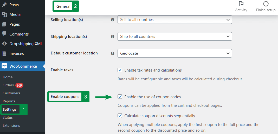
Before using coupon features in the mini cart, ensure WooCommerce Coupons are enabled on your site:
-
Navigate to WooCommerce > Settings in your WordPress dashboard.
-
Under the General tab, scroll down to the Enable coupons section.
-
Check the box for “Enable the use of coupon codes”.
-
(Optional) Check “Calculate coupon discounts sequentially” if you want multiple coupons applied step-by-step (e.g., applying the second coupon to the already discounted subtotal).
-
Click Save changes.
2. Creating & Managing Coupons #
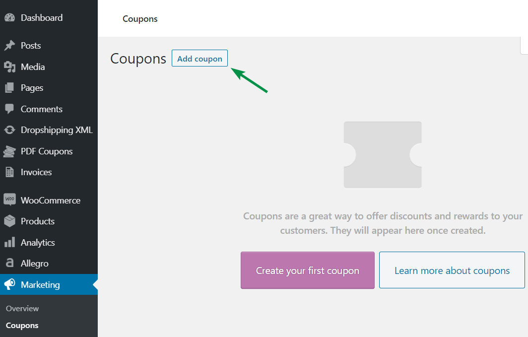
To create a new coupon for your store:
-
Go to Marketing > Coupons in your WordPress menu.
-
Click the Add coupon button at the top.
-
Fill in the essential details:
-
Coupon code: Enter the discount code customers will type or select (e.g.,
SAVE10). -
Description: Add an optional note for admin reference to identify specific promotions or marketing campaigns.
-
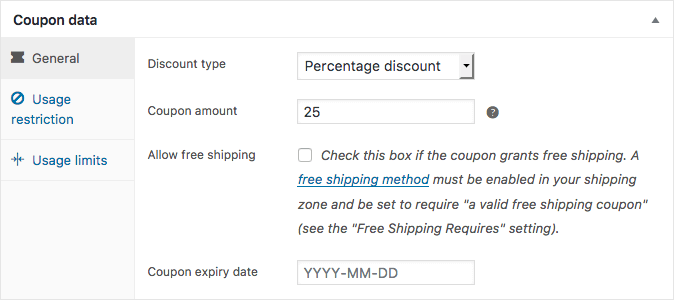
General / Usage Restrictions / Limits: Set discount types (percentage or fixed), minimum spend, and usage limits as needed.
-
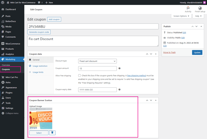
3. Adding Banner Images to Coupons (Mini Cart Display) #
You can assign a custom promo image/banner to each coupon, which will appear in the mini cart coupon modal:
-
Open the coupon edit screen (Marketing > Coupons > Edit).
-
Scroll down to the Coupon Banner Section at the bottom.
-
Click Select Image to upload or choose a promo photo from your Media Library.
-
Click Update / Save to apply the image.
For Developers: You can retrieve the uploaded coupon banner image URL programmatically using the following custom field post meta:
PHP
<?php echo get_post_meta( $coupon_id, 'whmcouponimage', true ); ?>
 #
#
4. Mini Cart Coupon Settings #
This section controls the appearance, messaging, modal options, and layout of the coupon feature inside the mini cart drawer.
A. General Coupon Bar Settings #
-
Coupon Icon: Choose a vector icon (e.g.,
icon_d-1toicon_d-11) to display next to the coupon trigger field, or selectwhmcNoneto hide it. -
Icon Color: Pick the custom color for the coupon bar icon.
-
Text: Enter the custom label text for the coupon section trigger (e.g., “Have a promo code?”).
-
Disable this field: Enable this checkbox to completely hide the coupon input section from the mini cart.
B. Coupon Input & Modal Settings #
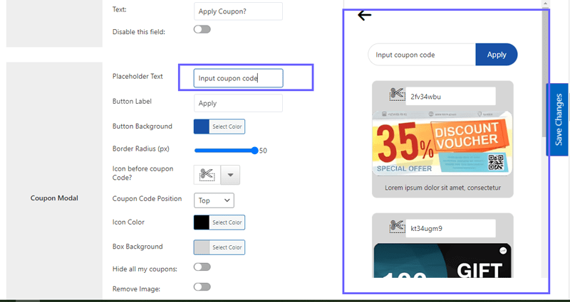
-
Placeholder Text: Enter the helper text displayed inside the coupon input field (e.g., “Enter coupon code here…”).
-
Button Label: Customize the label text on the apply button (e.g., “Apply”, “Redeem”).
-
Button Background: Select the background fill color for the apply coupon button.
-
Border Radius (px): Set the corner roundness of the apply button in pixels (Default:
50pxfor a rounded pill shape).
C. Available Coupons List & Modal Customization #
-
Icon before Coupon Code: Select a vector icon (
icon 1toicon 10) to display alongside each available coupon card in the modal list, or choosewhmcNone. -
Coupon Code Position: Choose where the discount code title/badge is aligned inside the coupon card layout (
ToporBottom). -
Icon Color: Pick the color for the icon displayed on available coupon cards.
-
Box Background: Choose the background fill color for individual coupon card boxes inside the modal.
-
Border Style: Select the border outline style for coupon cards (
Solid,Dashed,Dotted, orNone). -
Border Width: Set the border thickness for coupon cards (
1px,2px,3px, or4px). -
Border Color: Choose the color for the coupon card border lines.
-
Hide all my coupons: Check this option to hide the list of pre-configured available coupons so users must manually type their code.
-
Remove Image: Toggle this option to hide uploaded coupon banner images inside the modal.
-
Remove Coupon Description: Check this box to hide the description text on individual coupon cards for a more compact list view.
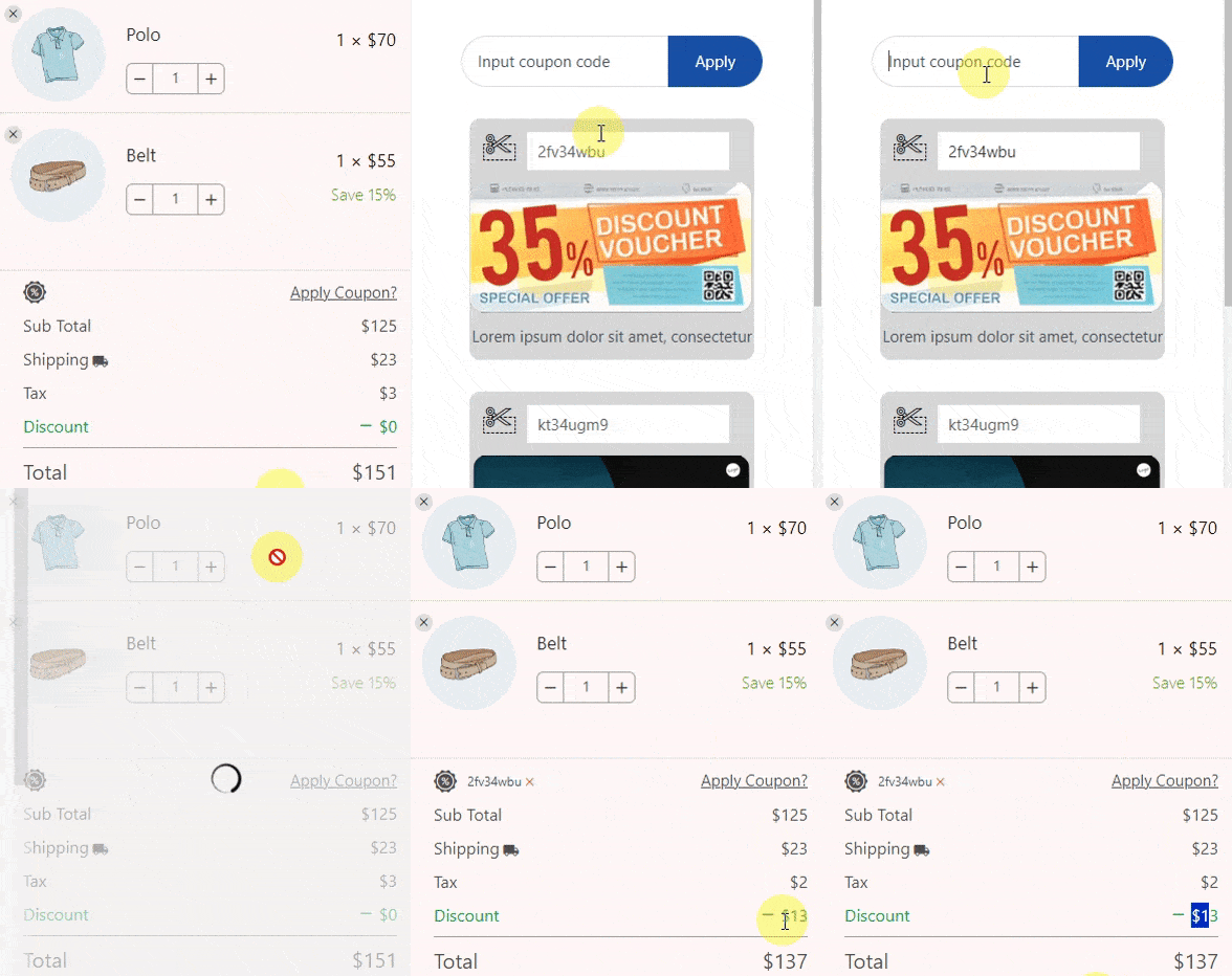
The frontend view of the Apply coupon #
Coupon Modal: #
Clicking on any option will show the live preview of the coupon model
Estimate Delivery Settings: #
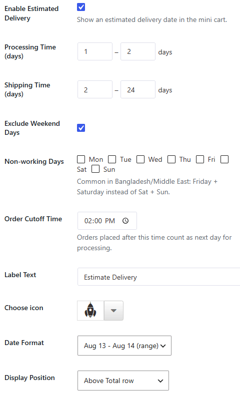
The Estimate Delivery feature displays an automated, real-time delivery timeframe in the mini cart to boost customer trust and set clear shipping expectations before checkout.
1. General Configuration #
-
Enable Estimated Delivery:
-
Type: Toggle / Checkbox
-
Description: Enable this option to calculate and show an estimated delivery date range directly inside the mini cart drawer.
-
2. Timeframe Calculation Rules #
-
Processing Time (days):
-
Type: Range Input (Min – Max)
-
Default:
1to2days -
Description: Set the number of days your store takes to prepare and dispatch an order before shipping.
-
-
Shipping Time (days):
-
Type: Range Input (Min – Max)
-
Default:
2to24days -
Description: Set the carrier transit duration from dispatch to final delivery.
-
-
Order Cutoff Time:
-
Type: Time Picker
-
Default:
02:00 PM -
Description: Orders placed after this cutoff time will automatically start processing on the following business day.
-
3. Non-Working Days & Holidays #
-
Exclude Weekend Days / Non-working Days:
-
Type: Multi-select Checkboxes (
Mon,Tue,Wed,Thu,Fri,Sat,Sun) -
Description: Select your store’s non-operational days so they are excluded from the estimated delivery date calculation.
-
Example: Select
Fri+Satfor Bangladesh/Middle East regions, orSat+Sunfor standard global schedules.
-
4. Display & Formatting #
-
Label Text:
-
Type: Text Input
-
Default:
Estimate Delivery -
Description: Customize the heading label shown next to the delivery date range in the mini cart.
-
-
Choose Icon:
-
Type: Icon Picker / Dropdown
-
Description: Select a vector icon (e.g., shipping truck or calendar icon) to display alongside the delivery estimate text.
-
-
Date Format:
-
Type: Dropdown
-
Default:
Aug 13 - Aug 14 (range) -
Description: Choose how the estimated delivery date range is displayed to shoppers.
-
-
Display Position:
-
Type: Dropdown Options
-
Options:
Above Total row,,Below Checkout Button, -
Description: Choose the exact placement of the estimated delivery block inside the mini cart drawer layout.
-
Shipping: #
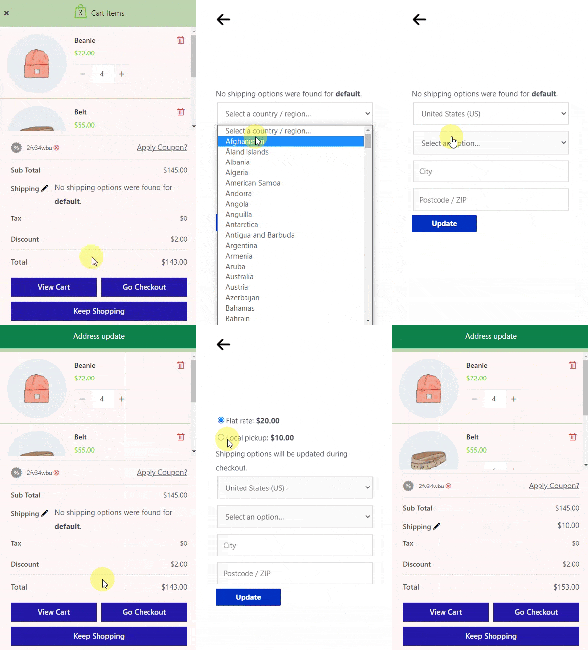
By clicking on the pen icon next to Shipping in the front end, the shipping calculator will open, where the customer can input the location and calculate the shipping cost.
The front-end view of the Shipping Calculator on the Sidebar Mini cart:
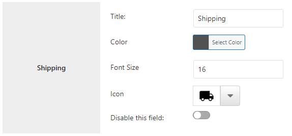
Change the Text and Color from Settings Page: You can change the shipping text and icon from settings
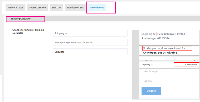
Shipping modal customization: #
To change the shipping model text. Find the Miscellaneous tab on the plugin settings page. Then you will get fields like below
How to Set Up WooCommerce Shipping: #
In the WordPress dashboard, go to WooCommerce > Settings. Select the Shipping tab.
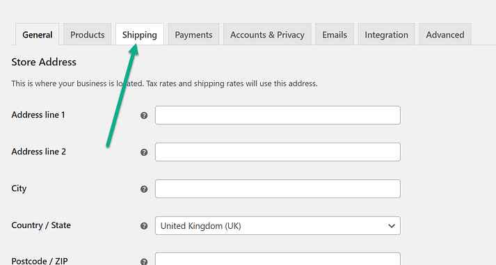
This is where you’ll find all of the built-in WooCommerce shipping settings.
Under the Shipping Zones tab, click on the Add Shipping Zone button.
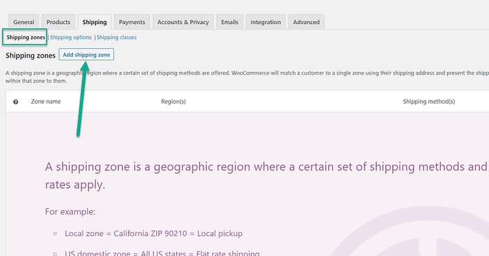
A shipping zone is a geographic region you set for your store. This allows you to link specific shipping methods and costs for each region. For instance, you may consider having a cheaper shipping rate to all United States customers but raise the price for Canadian customers.
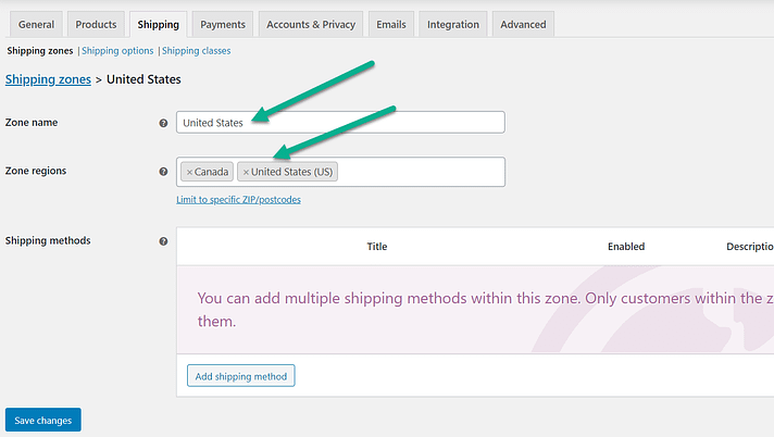
Choose a Zone Name for your reference. Select a Zone Region as well. You can search for possible regions or use the dropdown feature to scroll through the list of locations.
As an example, we’ve chosen Canada and the United States.
More specific shipping zones are available as well, like with the individual states through the USA.
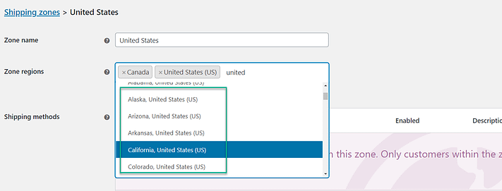
Once you define the shipping zone, scroll to the bottom of the page and click the Add Shipping Method button.
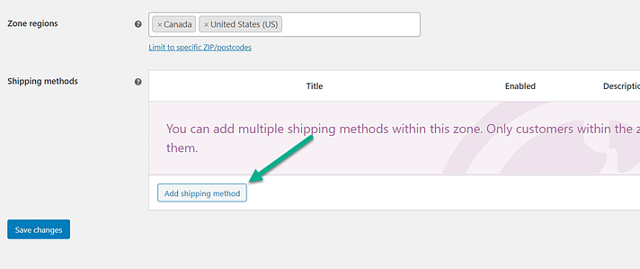
Each zone needs a shipping method for specifying how you’ll charge customers in those geographical regions. For instance, you may decide to implement flat-rate shipping for most customers but also local pickups for the surrounding community.
The three default shipping methods include:
- Flat Rate
- Free Shipping
- Local Pickup
If you have any questions about the meanings of these methods, please refer to the descriptions covered earlier in the article.
Select a shipping method out of the three. In general, a flat rate is a good place to start with maybe a free shipping option for those who reach a certain price point.
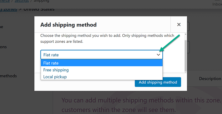
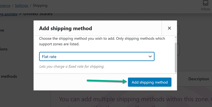
Click the Add Shipping Method button to save and continue.
Each shipping method gets saved under a list for that particular shipping zone. You have the option to include multiple shipping methods per geographical zone depending on the type of shipping options you’d like to offer.
To add another method, click on the Add Shipping Method again.
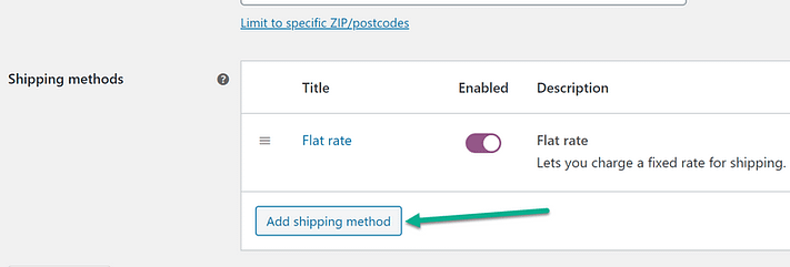
An example of this scenario involves having both a flat rate for everyone in the United States but also providing free shipping for minimum spending. As you create each shipping method, you must go back to that list of shipping methods and click the Edit button for each one.
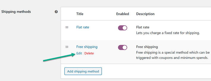
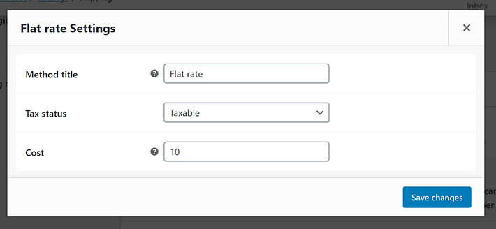
This is how you set specific details for the WooCommerce shipping methods.
You may, for instance, have a $10 flat rate and indicate that it’s taxable
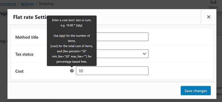
WooCommerce also includes options for creating quantity and percentage-based shipping fees – follow the guidelines under the question mark icons.
Each shipping method has its settings to configure. If you click the Edit button for Free Shipping, it asks when to activate the free shipping for customers.
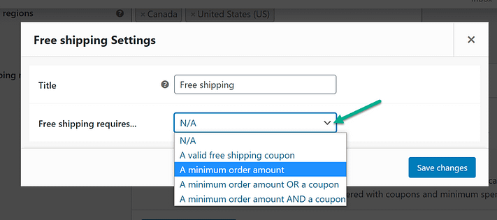
One method is to set a minimum order amount, where shoppers can access free shipping when they reach a certain dollar amount in their cart.
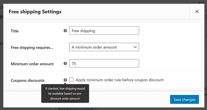
For More details about How to Set Up WooCommerce Shipping. Read this article
Tax: #
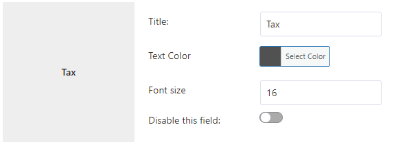
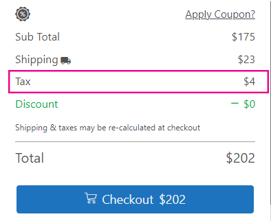
The sales tax amount is displayed here. You can customize the title and taxonomy from the settings page and disable this section if you want.
How to enable Tax on the WooCommerce site: #
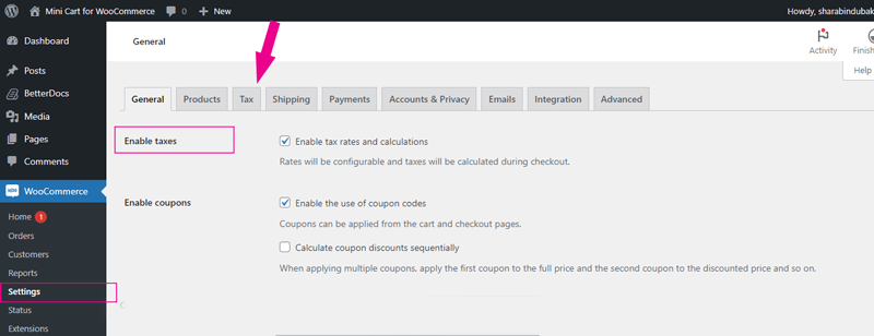
Go to the WooCommerce > Settings > general. you will find Enable Taxes. check the box and save. the Tax tab will be active
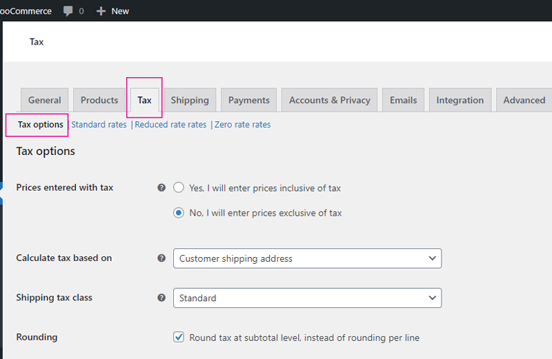
WooCommerce Tax Option: #
The Tax option is under Tax on the WooCommerce Settings page. Set the tax as per your need
WooCommerce tax Rate Settings: #
Click the standard rate and the click insert row and input the tax rate as per the image below. the tax rate will be active
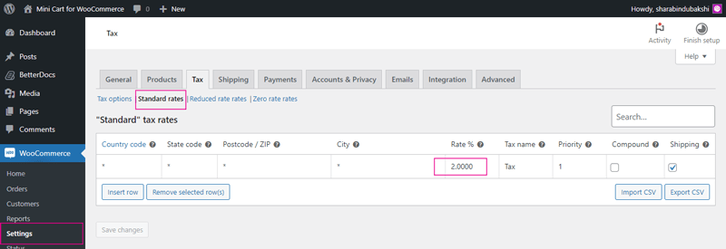
For more details about Setting up Taxes in WooCommerce. Read this article
Tax is set, now tax will be visible in the sidebar mini cart when a customer adds a product item to the cart. for example the below